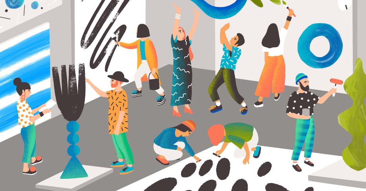

A brand doesn’t need to look minimalist or follow every trend. It can use colors, but it should appear professional. It needs personality. A visual identity goes far beyond a pretty logo: it communicates who you are, what you stand for, what makes you different, and how you want to connect with people.
In a world full of visual stimuli, getting people to recognize and remember your brand is a real challenge. That’s why building a cohesive and intentional aesthetic is more important than simply creating attractive designs. It’s about developing a visual identity that makes sense and reflects the essence of your business, without relying on filters or formulas.
1. Less Trends, More Personality
Before choosing colors, fonts, photographs, or graphic elements, ask yourself what you want to communicate. Every element of your visual identity should have a purpose and reflect your brand’s personality. Do you want to convey creativity, trust, approachability, or innovation? Your design choices should help tell that story.
Getting inspired by trends is great, but following all of them can make your brand lose its authenticity. You don’t need to look like your competitors or use the same design elements you see on Pinterest. What’s important is finding your own visual language, one that helps you stand out and connect with people who genuinely relate to what you do.
2. Being Colorful Means Being Consistent, Too
A visual identity doesn’t have to be boring to look professional. At my brand, Chipocluda, we know this firsthand! Our Art in a Minute capsules are a great example of how colors, illustrations, compositions, and different graphic elements can come together to create an identity full of personality. Each video has its own visual universe, but they all share a recognizable essence.
The key is to establish certain elements that bring consistency to your communication: a color palette, typography, graphic styles, and visual resources that can be adapted to different formats. This allows you to experiment, play, and get creative without losing consistency. Because having a colorful brand doesn’t mean throwing everything together without a plan; it means knowing how to combine each element to communicate more effectively.
3. Make It Look Good, But Make It Mean Something
An attractive aesthetic can catch people’s attention, but an authentic identity is what builds connections. Your brand should communicate more than just a good first impression: it needs to express its values, personality, and unique value proposition. When what you show visually aligns with what you offer, you build trust and make your brand more memorable.
Before thinking about changing your logo or completely redesigning your visual identity, take a step back and ask yourself: Does my brand truly reflect who I am? Is it easy to recognize? Does it stand out from the competition? You don’t need to follow every trend to win your audience over. You need a well-thought-out, cohesive visual identity that, above all, stays true to your essence.
No filters, no formulas, and no copying others. Your brand doesn’t need to look like someone else’s to make people fall in love with it; it just needs to stay true to its essence.